Rust Bucket Brewery, the craft beer brewed with determination and grit for the everyday working person.

The photography in this campaign is %100 original and is from a vintage collection belonging to the family.
This fictitious brand was created to demonstrate the beauty that can exist in a small space such as a beer bottle label.
Objective
To create a bottle label and series of marketing and supporting graphics for a fictitious beer brand. The label needed to incorporate illustrations, strong typographical hierarchy and work as a real world solution. The employee uniforms needed to conform to a limit of 3 colours including white. The magazine ad’s were required to showcase the brand while being informative and captivating. While only one was required as a final, I chose to continue with my semi-comprehensives and create a series.
Process
Starting with the illustrations, I needed to come up with something I was confident in. I didn’t have to look far since I wanted to lean into a vintage style photo paired with a modern grid structure and clean typefaces. Ultimately I went searching through a box of old photos and found my dad’s 1974 Volkwagen Sunbug.
I was inspired by the Sunbug label and continued to some of the other projects my dad had completed over the years. The most satisfying part of this project was giving new life to otherwise forgotten photos.

Thank you to John Pascual for the stunning product shots. @johnnpascual
Designed for originality and inspired by family.
A QR code was added in a small recognizable group as a call to action for the viewer. Ideally positioned in a magazine like the LCBO seasonal release, this ad was intended to show off the brand’s personality in a subtle way.
Designed to spark emotion.
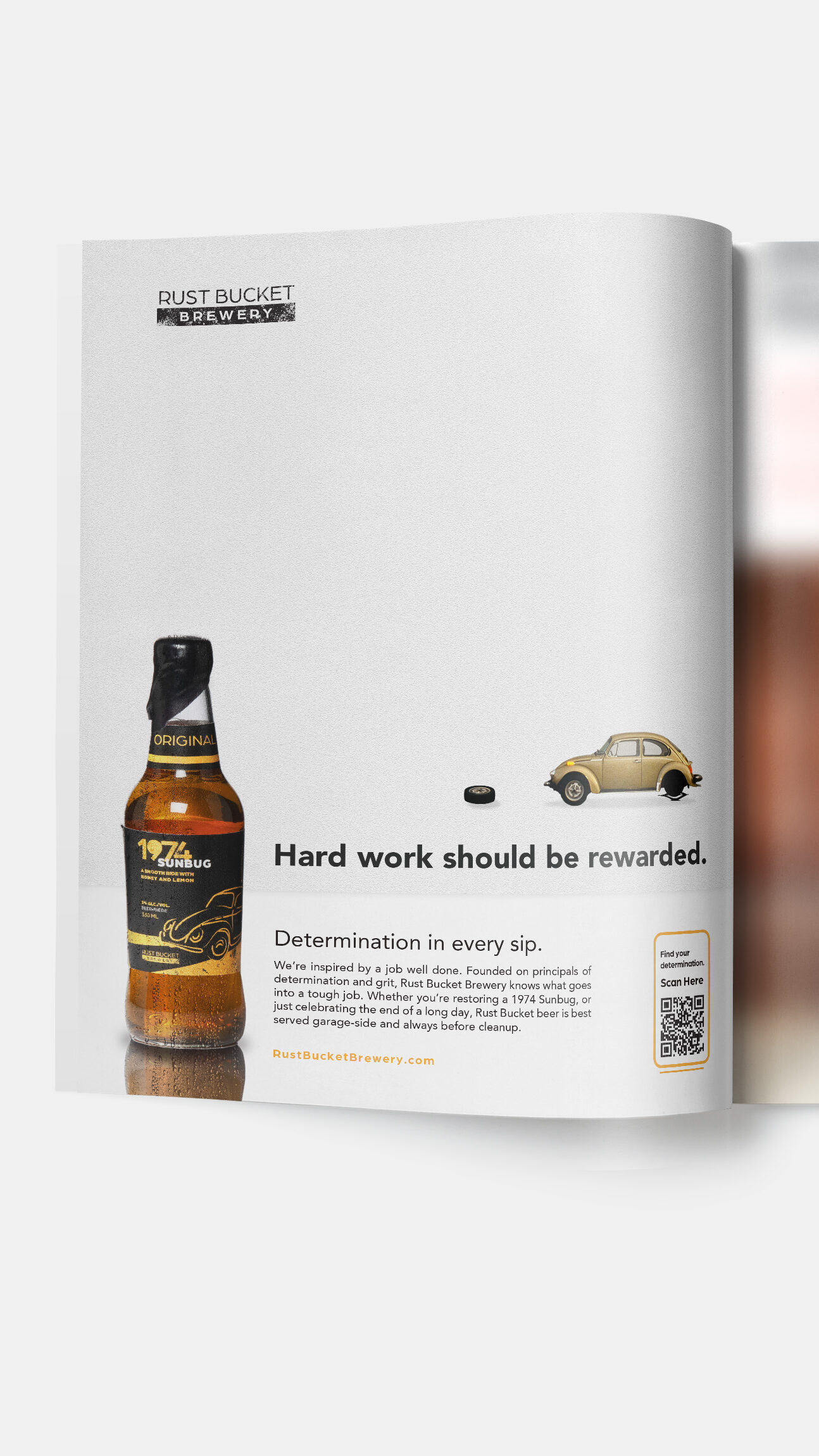
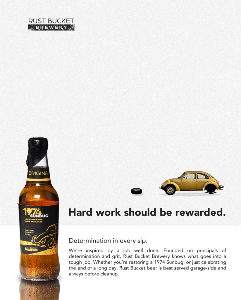
In the first ad concept, I designed the composition to be very simple and clean with use of white space. The humour in this ad can be realized most effectively by its target audience; trades and labourers. Many in this audience have or will experience a frustrating car repair and can quickly relate to the situation shown.

These are the proposed company uniforms for use by staff during promotional periods. The shirt was designed to conform to a 2 colour + white screen print. The template is also original.
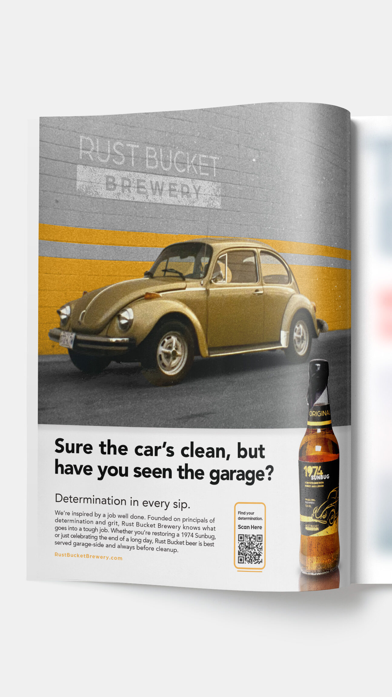
This photography is original and only lightly altered to accentuate the car within the scene. Effort was made to otherwise preserve the image grain and resolution to hold true to the vintage feel of the campaign.
Designed to spark feeling.
In the second ad concept, I designed the composition to have a sense of humour. The headline plays on a stereotype for most vehicle owners that while the car is usually clean, the garage is a mess.

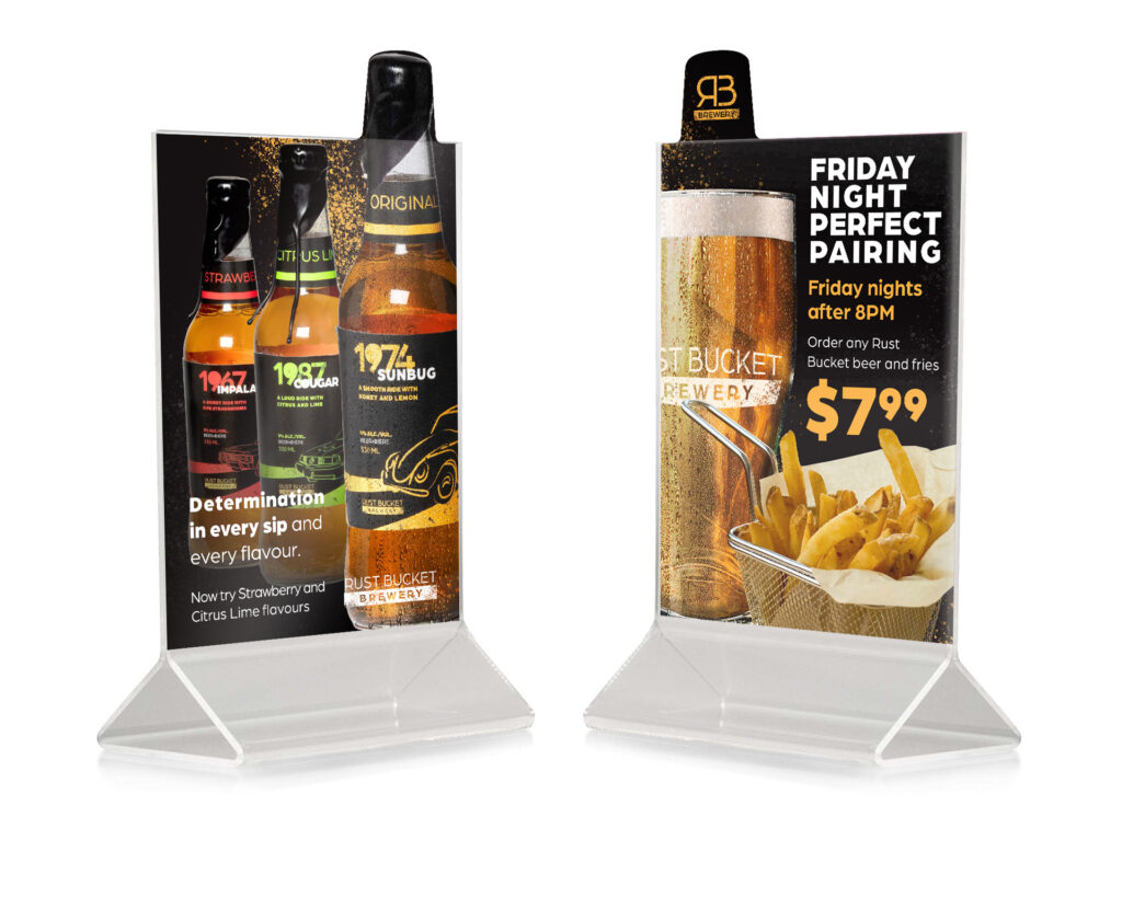
These table talkers were designed with a custom die-line in Adobe Illustrator, Photoshop, and InDesign. The photography is original and and the pieces were edited together to create a table top advertisement that captures attention and shows off the products creatively.